Improvement
High contrast theme improvements
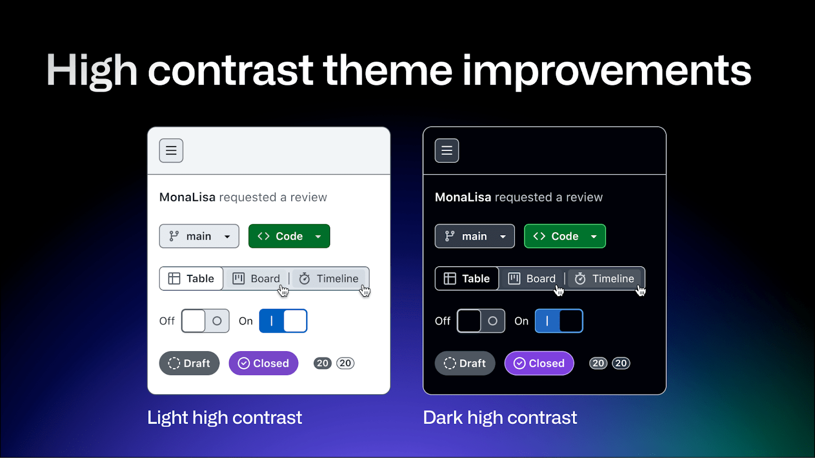
The light and dark high contrast themes have been updated to improve readability.
Now:
- Both themes aim to meet a minimum contrast ratio of 7:1 for all elements, and the secondary or “muted” text and icons appear slightly lighter or darker than the default text, enhancing the visual hierarchy throughout GitHub’s interface.
- In the light high contrast theme, the global navigation bar appears inset with a darker background color.
- In the dark high contrast theme, the foreground text over solid backgrounds is now white, and higher contrast borders have been added to all interactive elements.