Introducing the New GitHub Graphs
Translations: Ukrainian. We’ve revamped our existing graphs and added three new graphs to help you discover even more about GitHub hosted repositories. Contributors See who’s contributing to a project and…
Translations: Ukrainian.
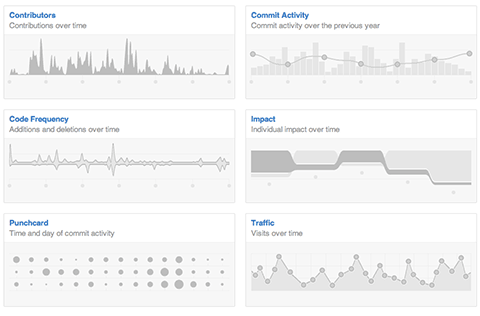
We’ve revamped our existing graphs and added three new graphs to help you discover even more about GitHub hosted repositories.
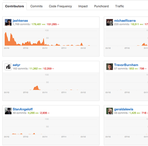
Contributors
See who’s contributing to a project and their contributions relative to other contributors.
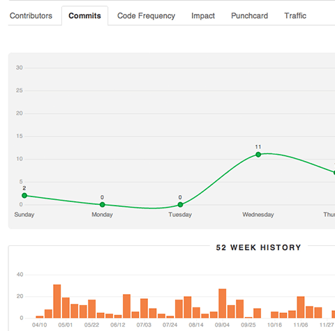
Commit Activity
Commit activity for the past year with a week by week breakdown.
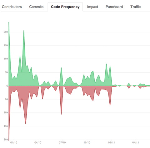
Code Frequency
See additions and deletions over the lifetime of a project.
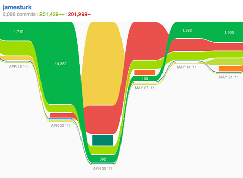
Impact
See individual impact over time. Historical update: The Impact graph is no longer a GitHub feature
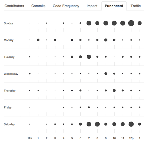
Punchcard
See the hour and day when commits are most frequent.
The new GitHub graphs are built with the amazing d3 library by @mbostock.
Written by

Related posts
We need a European Sovereign Tech Fund
Open source software is critical infrastructure, but it’s underfunded. With a new feasibility study, GitHub’s developer policy team is building a coalition of policymakers and industry to close the maintenance funding gap.
GitHub Availability Report: June 2025
In June, we experienced three incidents that resulted in degraded performance across GitHub services.

From pair to peer programmer: Our vision for agentic workflows in GitHub Copilot
AI agents in GitHub Copilot don’t just assist developers but actively solve problems through multi-step reasoning and execution. Here’s what that means.