Retiring Impact Graphs
Back in April, we launched some amazing new graphs. One of the new visualizations we’ve found especially useful is the contributors page. We’re constantly looking at it to get a…
Back in April, we launched some amazing new graphs.
One of the new visualizations we’ve found especially useful is the
contributors page.
We’re constantly looking at it to get a sense of activity on our projects. It’s
a great way to see who’s contributing and how much of an impact they’re having
relative to other members of a project. The contributors page today is a much
better impact graph than the impact graph ever was.
So today, after four years in service, we’re retiring the impact graph.
Contributors to github
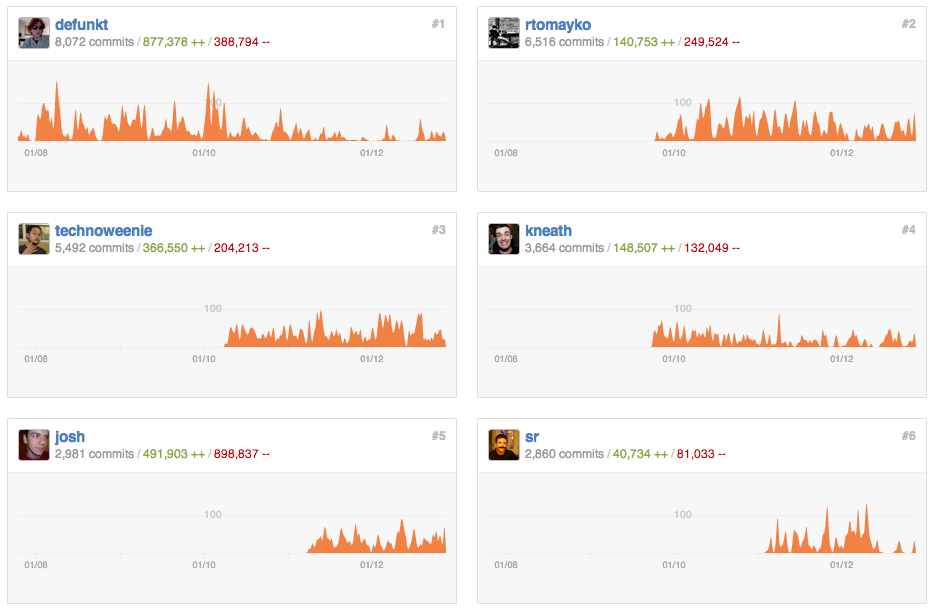
Check out the contributions page of a few of our favorite repositories:
Written by

Related posts
We need a European Sovereign Tech Fund
Open source software is critical infrastructure, but it’s underfunded. With a new feasibility study, GitHub’s developer policy team is building a coalition of policymakers and industry to close the maintenance funding gap.
GitHub Availability Report: June 2025
In June, we experienced three incidents that resulted in degraded performance across GitHub services.

From pair to peer programmer: Our vision for agentic workflows in GitHub Copilot
AI agents in GitHub Copilot don’t just assist developers but actively solve problems through multi-step reasoning and execution. Here’s what that means.