dark-mode

Subscribe to all “dark-mode” posts via RSS or follow GitHub Changelog on Twitter to stay updated on everything we ship.

~ cd github-changelog
~/github-changelog|main git log main
showing all changes successfully

a11y contrast improvement

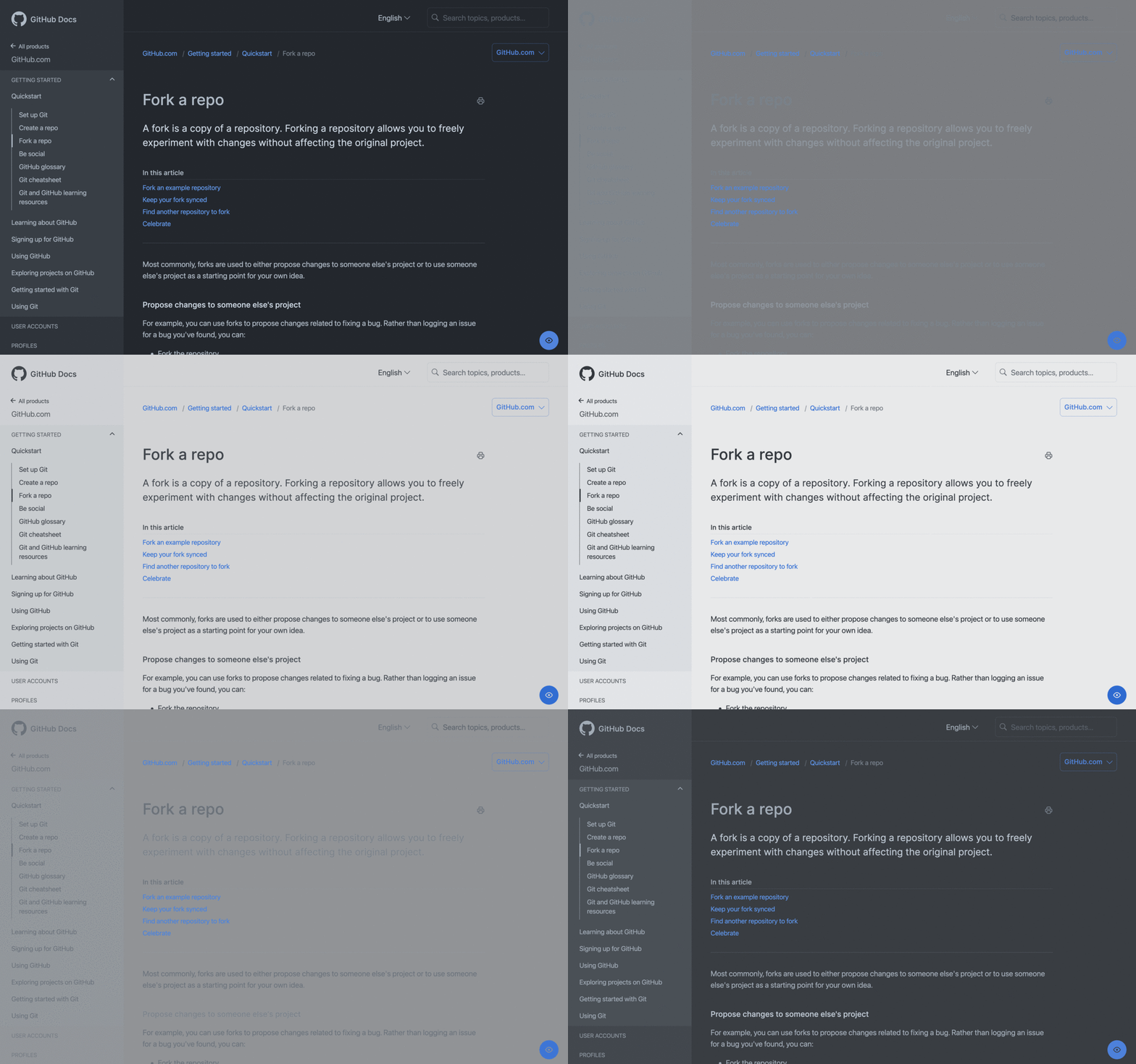
We improved the color contrast of our default light and dark themes on github.com, making them accessible to all users. These changes were made to Primer, GitHub's Design System, as part of our commitment to making GitHub inclusive to all developers. Visit accessibility.github.com for more information.

The VS Code light and dark themes will also be updated to match these changes.

See more

Users can now specify the theme an image is displayed for in Markdown. Appending #gh-dark-mode-only or #gh-light-mode-only to the end of an image url will define whether it's only shown to viewers using a light or a dark GitHub theme. For example:

Two screenshots of the same issue in dark and light color mode demonstrating the two fragment options by showing an optimized github logo for each color mode

The GitHub logo in the above screenshots uses the following Markdown to specify the theme context:

![GitHub-Mark-Light](https://user-images.githubusercontent.com/3369400/139447912-e0f43f33-6d9f-45f8-be46-2df5bbc91289.png#gh-dark-mode-only)![GitHub-Mark-Dark](https://user-images.githubusercontent.com/3369400/139448065-39a229ba-4b06-434b-bc67-616e2ed80c8f.png#gh-light-mode-only)
See more

A dark high contrast theme, with greater contrast between foreground and background elements, is now available to all github.com users as a public beta. Opt-in to the beta by enabling the theme in your Feature Preview settings, located in the profile menu dropdown. Once the Feature Preview has been enabled, navigate to the "Appearance" page in your profile settings to choose the dark high contrast theme.

Please note, you may notice color issues with other themes when in this beta. If they are disruptive you can opt-out by disabling in Feature Preview.

Share feedback

Animated image of switching between dark default theme and dark high contrast on the appearance settings page

See more

Dark and dark dimmed themes are now generally available to all github.com and GitHub Enterprise Cloud users. The updated appearance settings included in this release are designed to give you more control over your theme preferences. Select Single theme or Sync to system to customize the themes that are active during day and night. GitHub will now default to match system preferences when a user is logged out, or when a user is logged in and theme preferences have not yet been set. Manage your theme settings in the "Appearance" tab located in your profile settings.

Share feedback

GitHub-dimmed-theme

See more

A dimmed theme, with a more subdued UI with a little less contrast than our dark mode theme, is now available to all GitHub.com users as a public beta. This update also includes new appearance settings to give you more control over which theme displays during the day and night. Opt-in to the beta by enabling the theme in your Feature Preview settings, located in the profile menu dropdown. Once the Feature Preview has been enabled, navigate to the "Appearance" tab in your profile settings to choose your preferred theme setting.

Share feedback

Screenshot of GitHub dimmed theme

See more